|
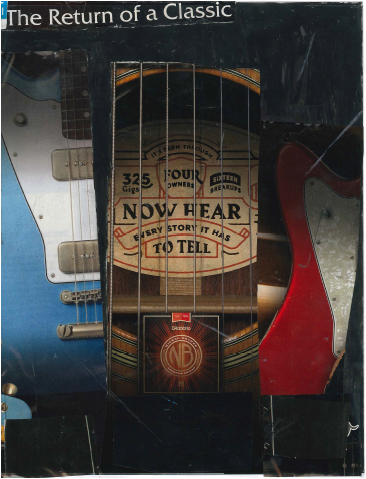
What you see in front of you is an advertisement towards "The Return of a Classic" string set that greatly improves your playing. At the top right of the screen, you can see the "Return of a Classic" text not only pops in the dark background of the advertisement but ushers in the success of the product. Your eye then flows nicely to the beautiful guitars on the left and right of the add. The colors blue and red provides a balanced color scheme that is pleasing to the eye. This is due to the element of color, the colors were purposely selected for the using of making the add pop in a very pleasing way. At the centerfold, there is the marvelous guitar strings being presented in an honored fashion. "Now hear every story it has to tell" is the perfect way to describe such an elegant and astounding sound that is produced through these strings. The company D'Addario's logo is shown within the center of the product. The product is shown in a dramatic fashion because of the outstanding use of the principle, balance. This provides a dynamic "zoom in" toward the product because of the use of space.
Throughout this project I learned a lot about the process, the endeavor, and the execution of putting together an advertisement. You have about half of a second to catch the eye of the potential buyer while they flip through a magazine. I learned about the balancing of colors, the natural flow of your eye throughout the add, and the ability to show off the product that makes the buyer say "I need this". This was truly an enlightening experience. |
Flyers
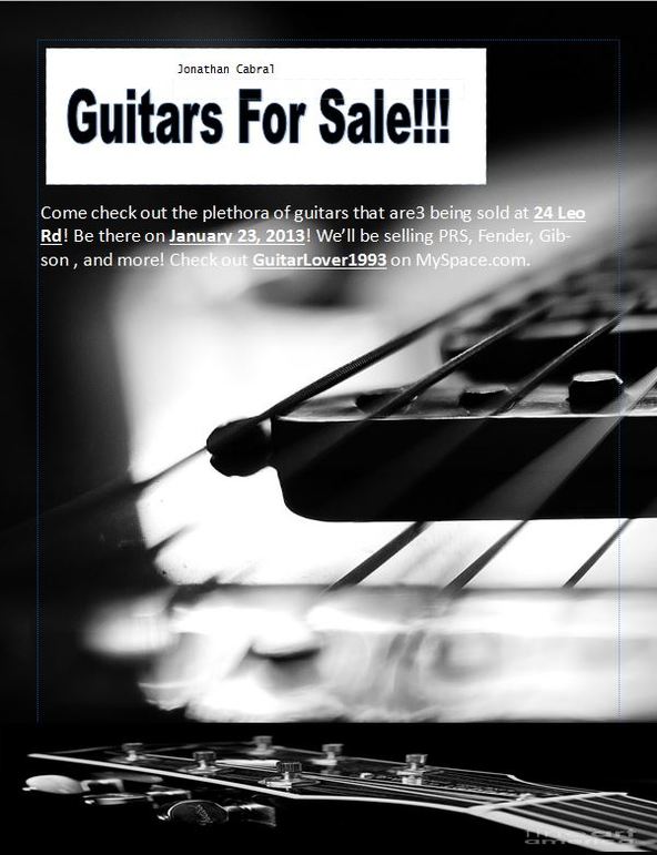
What you see here is three different flyer geared towards two different tasks. The Flyer directly left is a black and white remake of the image underneath. The Flyers title "Guitars for Sale" pops because of the effectiveness of the contrasting colors, black and white. Your eye then flows naturally to the information below. Line is then introduced into the flyer by being presented with a sleek view of the strings and pickups of the elegant guitar in the background. the flyer is completed by a simple use of balance and minimalism. The delicate use of balance is presented in the careful selection of where the text should start and where it should end, where the background will fade in and out, and the subtle implementation of the Gibson head located at the bottom of the page. The text on the flyer consists of details of who to contact, where to be, and what day the sale is going to happen on.
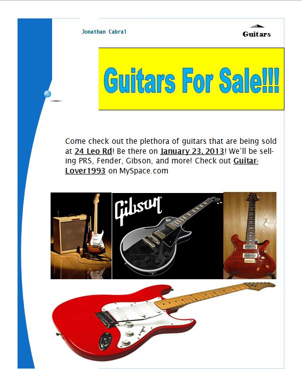
The original flyer is presented bellow. The first use of design presented is the the dramatic use of color used in the title text. The text color is blue, while the background is yellow. This provides a bright contrast between the text and the background/flyer. With the help of the elegant use of line, your eye follows the blue wave down the page until it finds the text. The text is reflective to the previously mentioned flyer. Balance is a key part of the flyer as well. The way that the bottom of the page seems full and complete because of the use of symmetry within the flyer (The top of the flyer has a title while the bottom has images to round off the flyer).
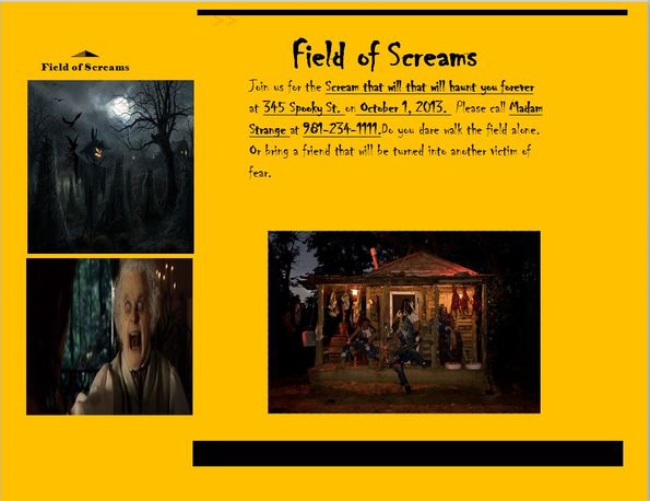
And finally the most "horrific" flyer of them all, the Halloween themed "Field of Screams" Flyer. The use of line is again presented to us through the use of providing a type of border on the top and bottom of the screen. This adds a "completed" feel and finish to the design. Directly underneath the border, the title will be presented in a dramatic fashion over the text. The text consists of where the "Field of Screams" will be held, who to contact, and what day the event is. Balance is then introduced to the flyer. The "L" design of the pictures surrounding the text provides a cradled and full look to the project. Finally, the iconic use of color presented completes the theme of "Halloween" and "Field of Screams". The iconic colors of black and orange truly represent Halloween as a whole. Within the project I again learned a lot about not only the perfect balance of information and use of images, but also the Microsoft Publisher Application as a whole. I've had some brief use with Publisher, but now I feel like I've almost mastered the program through this extensive project. I hope to use all that I've learned from this project to help apply it to my next, so I can make the next even better than the last.
The original flyer is presented bellow. The first use of design presented is the the dramatic use of color used in the title text. The text color is blue, while the background is yellow. This provides a bright contrast between the text and the background/flyer. With the help of the elegant use of line, your eye follows the blue wave down the page until it finds the text. The text is reflective to the previously mentioned flyer. Balance is a key part of the flyer as well. The way that the bottom of the page seems full and complete because of the use of symmetry within the flyer (The top of the flyer has a title while the bottom has images to round off the flyer).
And finally the most "horrific" flyer of them all, the Halloween themed "Field of Screams" Flyer. The use of line is again presented to us through the use of providing a type of border on the top and bottom of the screen. This adds a "completed" feel and finish to the design. Directly underneath the border, the title will be presented in a dramatic fashion over the text. The text consists of where the "Field of Screams" will be held, who to contact, and what day the event is. Balance is then introduced to the flyer. The "L" design of the pictures surrounding the text provides a cradled and full look to the project. Finally, the iconic use of color presented completes the theme of "Halloween" and "Field of Screams". The iconic colors of black and orange truly represent Halloween as a whole. Within the project I again learned a lot about not only the perfect balance of information and use of images, but also the Microsoft Publisher Application as a whole. I've had some brief use with Publisher, but now I feel like I've almost mastered the program through this extensive project. I hope to use all that I've learned from this project to help apply it to my next, so I can make the next even better than the last.
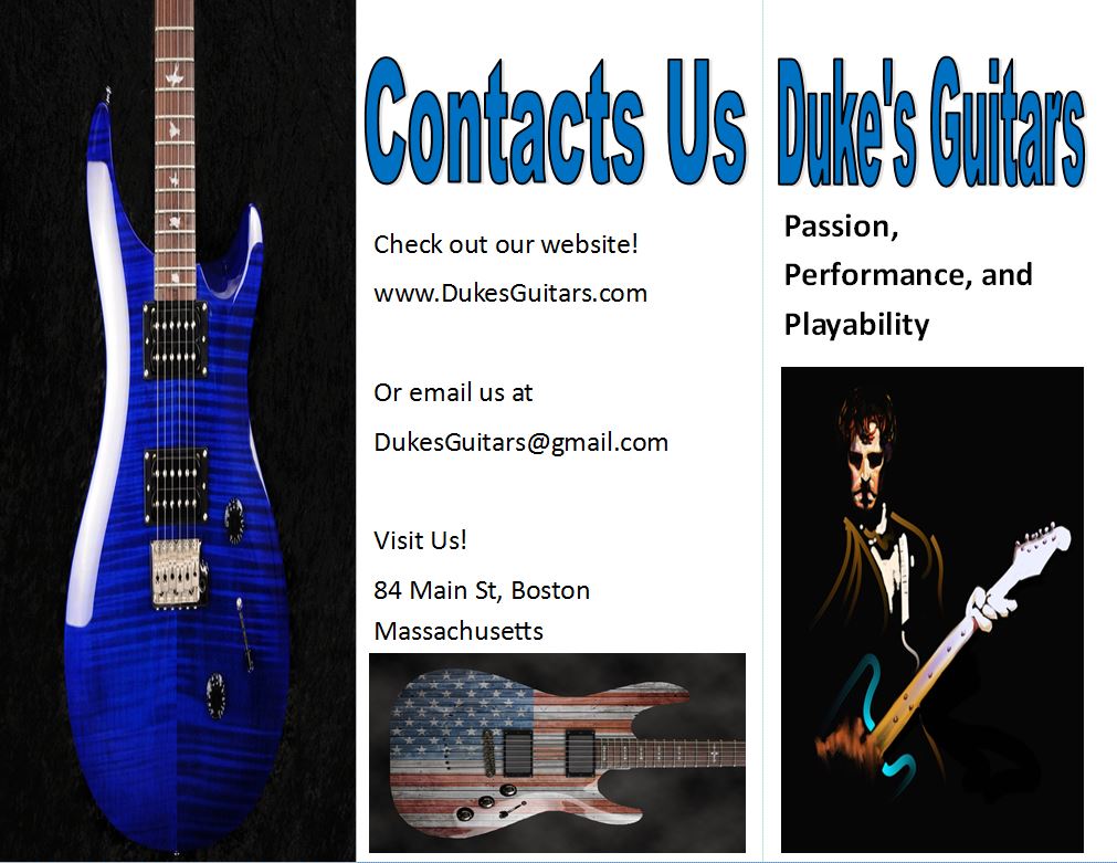
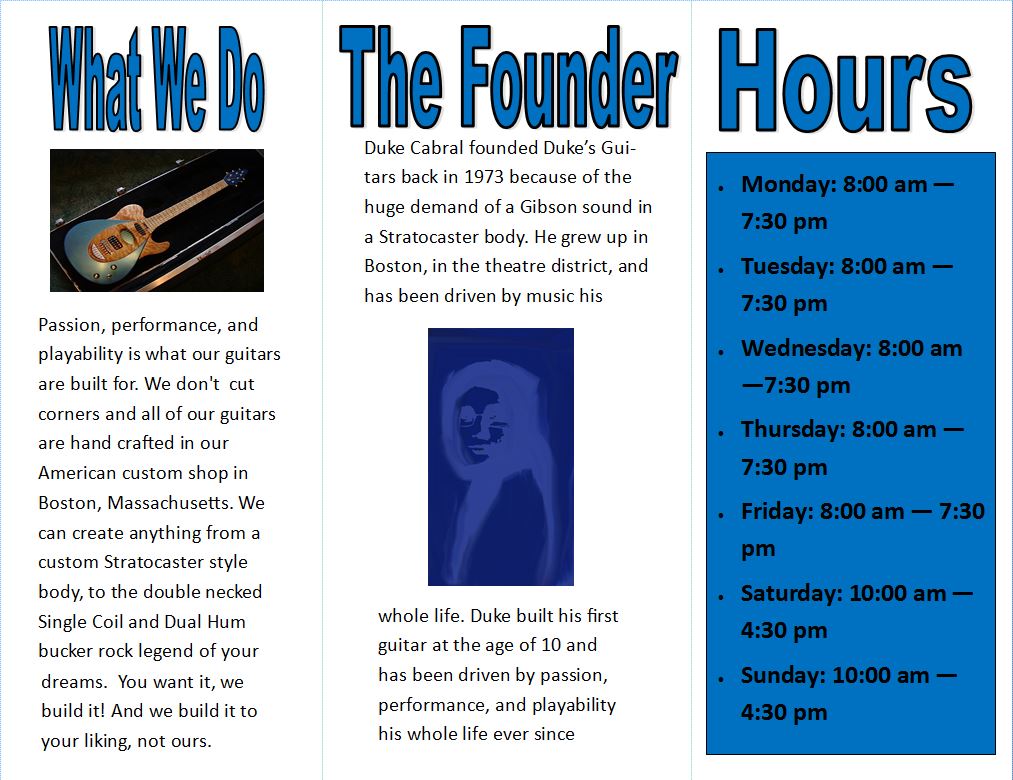
The first image displayed consists of the Front Flap, Back Flap, and the Inside Flap of the brochure. Using the element of design, size, "Duke's Guitars" pops from the page. This characteristic is then displayed throughout the rest of the brochure. Your eye then naturally follows the slogan, "Passion, performance, and playability". This provides and intriguing incentive to open the brochure and to see what is inside. Finally, the Front Flap is concluded with a picture of a professional guitarist. If you may look left, this is the Back Flap of the brochure. This page uses the element of design, space, to emphasize each way to contact the business. As stated on the brochure, you can email the company at [email protected], or you could visit the store at 84, Main St, Boston Massachusetts. If you would like to see the products online, then you can visit their website, www.DukesGuitars.com. Then on the Inside Flap, a sample picture of a guitar created by Duke's Guitars is shown to give the reader an idea of the type of beautiful work the Custom Shop can do. the image below shows the Inside Right Flap, Inside Middle Flap, and finally, the Inside Left Flap. The reader must be eager to read about the production and the creations of "Duke's Guitars", so starting on the left, the "What We Do" page tells the reader all about the great variety of creations that Duke's Guitars can do. Continuing in the Middle Flap, the "The Founder" section can be seen. But, like the Left Flap, this design utilizes the principle of balance. This is displayed in the spacing of text and the images added to the page. Furthermore down the "The Founder" page, you can see a self portrait of the founder, Duke. This was created using several filters in the filter gallery. Also, the brush tool and the smudge tool played a big effect in the "brush stroke" design. Then finally, on the Right Flap the "Hours" of the store are present. On Monday - Friday, the shop opens at 8:00 am and closes at 7:30 pm, while on Saturday and Sunday, the shop opens at 10:00 am and closes at 4:30 pm. That concludes the design process and some of the tools and methods I used to create this brochure. I learned a lot of different tools and methods of creation in Photoshop. I had some idea of what some of the tools did, but I feel like know I could create something decent with the skills that I have learned throughout this project. I hope to apply this new knowledge to future projects in not only this class, but on other classes and endeavors to come.
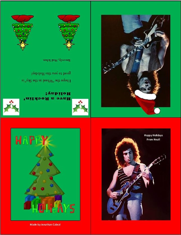
This greeting card is made by the Neal Schon of the legendary rock band, Journey. On the bottom right of the page, that is the edited picture of Neal Schon on the front cover of the Greeting Card. The edits made to this was through Photoshop, which consists of first, putting the "Dry Brush" filter over the original image. Then, once the filter was added, I noticed that the shadows emitted on his face had become to bright and did not balance well with the rest of the image. So, I darkened them which created a perfect balance between his face, and the shadows. This was accomplished by using the brush tool and using a darker shade. Next, I replaced the color of his Gibson Les Paul from Sunburst Red to a Blue shade using the color replacement tool. This matched with the shade and opacity of his jeans. Also, a "sparkle" had emitted after the filter, so I used the cropping tool to get rid of that annoying sparkle. I then took another section of the background and filled in the "blanks". Finally, I edited the background colors to a "smudged" black and dark brown background using the smudge tool. These five edits I believe enhance the look of Neal Schon's image on this 1985 Journey tour. Next, the image on the left is the back, which concludes the card with a final "Happy Holidays' completed with a Christmas Tree. Above the edited version of Neal Schon likes another picture of the legendary rock star, which I believe, provides a balanced and smooth introduction of the "Happy Holidays" message. Finally to the left is the message which is accompanied by the several images of "Holiday Cheer". Finally, the colored background was accomplished by inserting rectangle shapes, sending them to back, and coloring the rectangles the Holiday Colors. I learned even more about the process of using Photoshop. For example, I mastered the color replacement tool option which helped me accomplish a great deal of tasks within this project. I hope to use Photoshop more and learn more about the huge and expansive world of creating and editing on Photoshop.
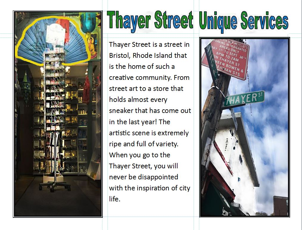
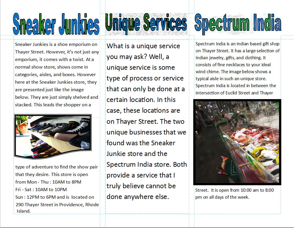
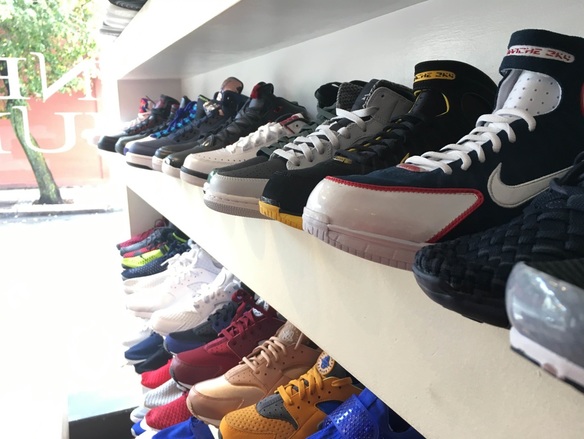
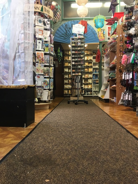
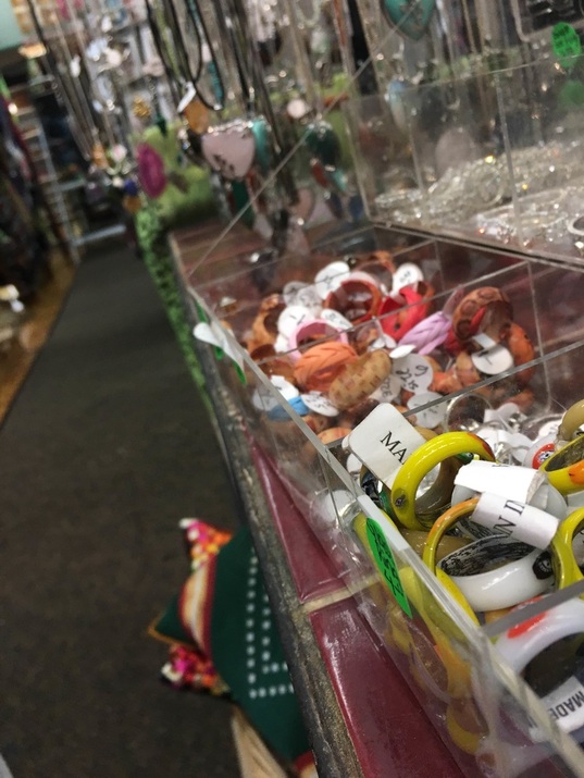
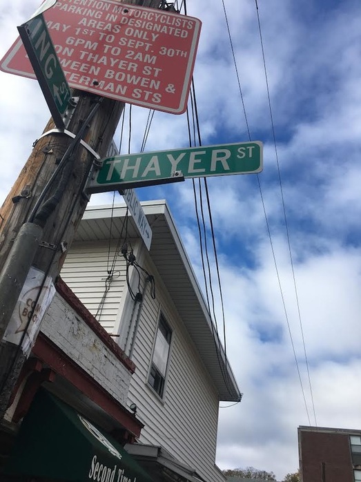
The images presented above are images of the Thayer Street Unique Services Brochure. To begin the overview of this, the top image is presenting you with the front, back, and first inside flap of the brochure. The front flap, "Unique Services" is supposed to intrigue the reader with a photo shopped image of Thayer Street. This Photoshop Job consisted of me using mixture of toner tools. For example, the house presented in the picture wasn't very pleasant to have in the picture, so, I whitened the house a brighter toners and I darkened the rest of the picture, except for the street sign, using the burn tool. This created this aura effect on the sign and house. ON the back flap, I gave a brief description of the of what Thayer Street is and what it consists of. From the ripe city life, to the artistic vibe of the stores in Thayer Street, there is something for everybody to be inspired by. Then on the left, is an edited picture of an aisle in Spectrum India. I used the burn tool and the brush tool to make the display pop. Also, I put a Brush Stroke Filter on the picture to add a different look. A final touch to the front side is that I took the titles of each section of the brochure and I took them into Photoshop and changed the color scheme, font layout, and the filter of each title. Then continuing to the second image, the second image shows the inside right, middle, and left flaps. On the inside right and left flaps, I gave two examples of the business visited by the members in my group. These businesses are "Spectrum India", an Indian themed gift shop store, and "Sneaker Junkies", a different take on a traditional shoe store idea. Both of these businesses we felt were unique because I have never seen a store like "Sneaker Junkies". Having the shoes just left out on shelves, not boxed, and not tagged presents a different feel to the store, and I've never seen anything like this. Spectrum India is very unique because of it's Indian Theme. You would expect that a gift shop on Thayer Street, would present trinkets of Thayer Street, but instead, this gift shop is themed with the Indian Theme, which initially took me by surprise. The edited picture on both sides were done slightly differently. Starting on the left, the picture of the lines of sneakers, I adjusted the camera view of the sneakers by using Photoshop to create a wide angle effect. then, I sharpened the first two shoes which created a focused effect. I then used the urn tool to darken the shelves which made the sneakers pop, and finally, I used the toner tool to brighten the line of shoes. ON the picture on the very left, I used the sharpening filter and created a focus point of the yellow bracelets. I then brightened the bracelets using the toner tool and I darkened the rest of the aisle using the burn tool. On both businesses however, I put their respective addresses and operating hours. In the middle, I then put a description of what a unique service is and what mt group looked for when in Thayer Street. I unfortunately, was not able to attend Thayer Street because of academic restraints, however, I learned a lot of different methods of Photoshop. For example, I never used the sharpening filter on Photoshop and I have never created a focus point on a picture. Almost all the methods that I described was discovered during this project. I never knew how to edited and create a truly custom text, but I was able to compete this for every title I made. Finally, I never saw the true impact of putting a "frame" around picture within a brochure, but now I realize the true effect it has on the overall professionalism displayed on any project. I truly enjoyed the discoveries I made on this project and I can't wait to apply the wide variety of skills that I have learned on to my next project.