Wish I Was There
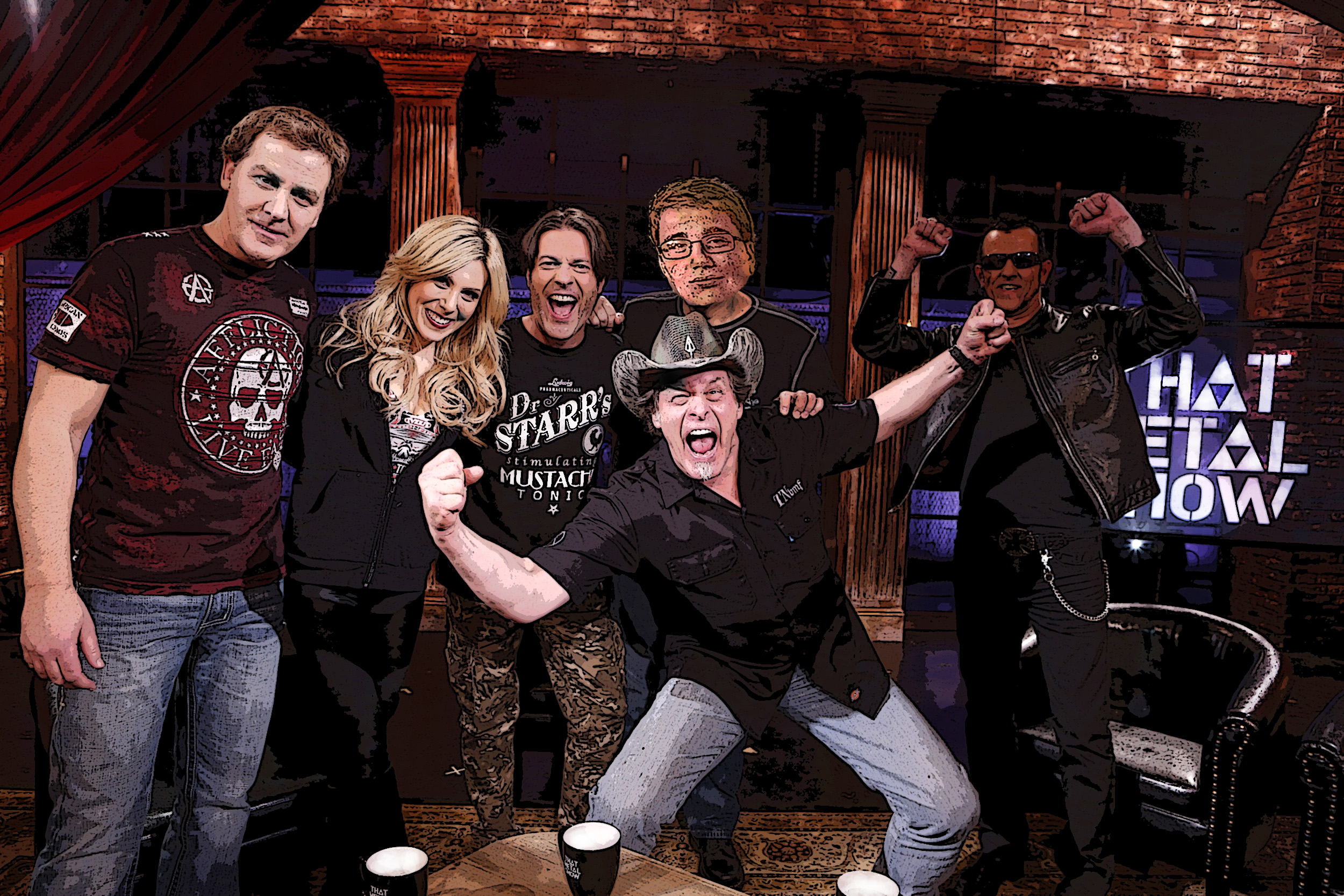
The image above is an edited version of a still picture of Gary Hoey's appearance on the famous Rock show, "That Metal Show". I was tasked with project pf Photoshopping my head onto one of the co-hosts faces next to Gary Hoey. How did I do this? I first took my original portrait picture and used the Magnetic Lasso Tool to select my head and make it its own layer. I then used the move tool to move the image of my face onto the same project as the original image. I then noticed an immediate problem, my skin tone does not match the co-host. So, I first used the Dodge Tool to "bleach" the color of my face so I was practically a ghost. I then took the eyedropper tool and then preceded to take the skin tone from the host's hand and apply it using the Color replacement Tool. This allowed my skin tone to somewhat resemble his. Next, I used the Show Transformation Controls to shrink my head onto his. However the method I used to match my head size to his consisted of lining up the eyes and then slowly enlarging my face to cover his. Then, I took the Eraser Tool and switched between layers to erase improper hairlines so both images lined up. I also noticed that there was a slight shadow on the right side of the co-hosts face. So, I used the burn tool to create a shadow effect on the right side of my face also. Since the lighting was poor in the original picture, I again used the dodge tool to brighten the cool colors and the whites on the picture. I Also used the Poster Edges filter on both layers to add a special flare to the picture. Finally, I used the red eye tool to make everyone's eyes seem natural. I really enjoyed this project. The amount of tools I finally learned how to use was enormous. For example, out of all the tools I just listed, I only knew how to use about two or three of them before this project which forced me out of my comfort zone. I never knew how to blend my face into an image, I never knew how to crop an image, and I definitely didn't know how to move the cropped image over to another image and then transform it. I seriously hope to get more projects like this because I really hope to delve deeper into the world of Photoshop and the never ending amount of creative propositions presented through these types of projects.
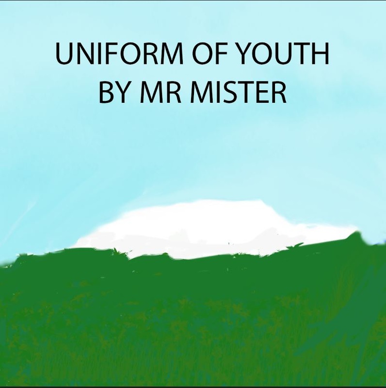
Uniform of Youth Album Cover
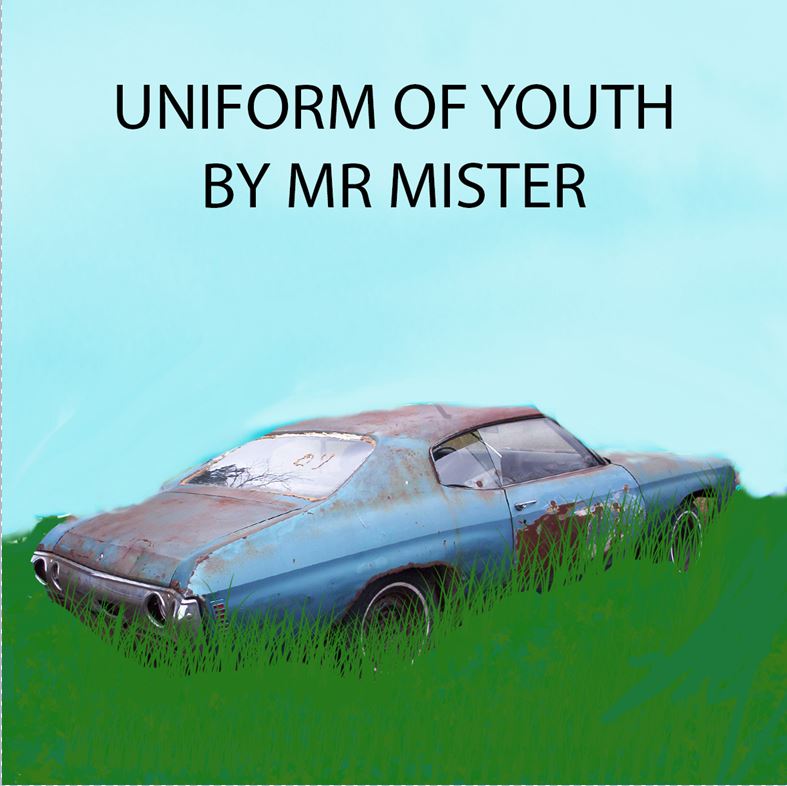
I explain the front cover steps below. On the back cover however, I wanted to carry out the sky blue and green grass look that I emulated on the front cover. So I took two rectangular images and colored them almost the same colors as the front picture. I then took the lyrics and copied them onto the back page. Finally, I out my Record Company, recycle symbol, "All Rights Reserved" and the year of copyright. I Truly loved working on this project because it allowed me to take one of my favorite songs and create an album cover that I believed told he story of this song. I will take all the tools that I learned with this project and apply it to future projects.
Only Original Image
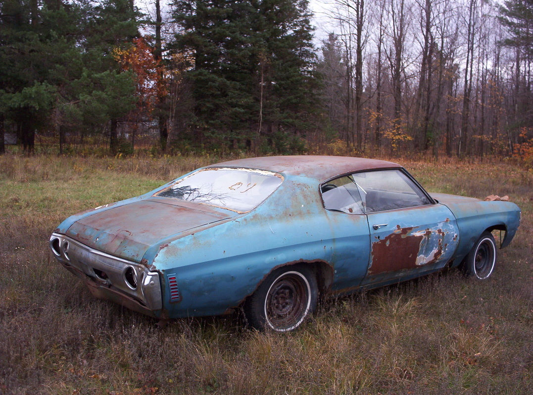
This is the image of the car before I edited the car out of this picture and into my picture.
Background Stages
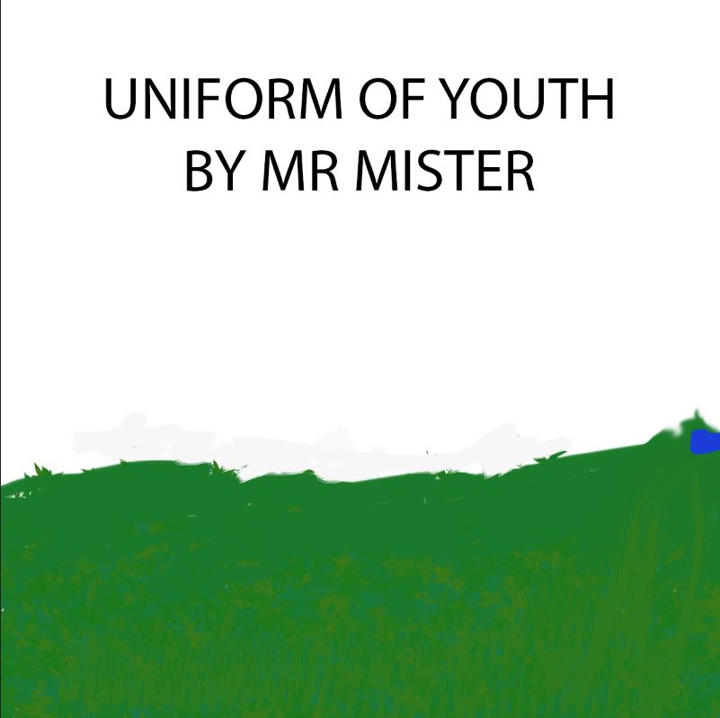
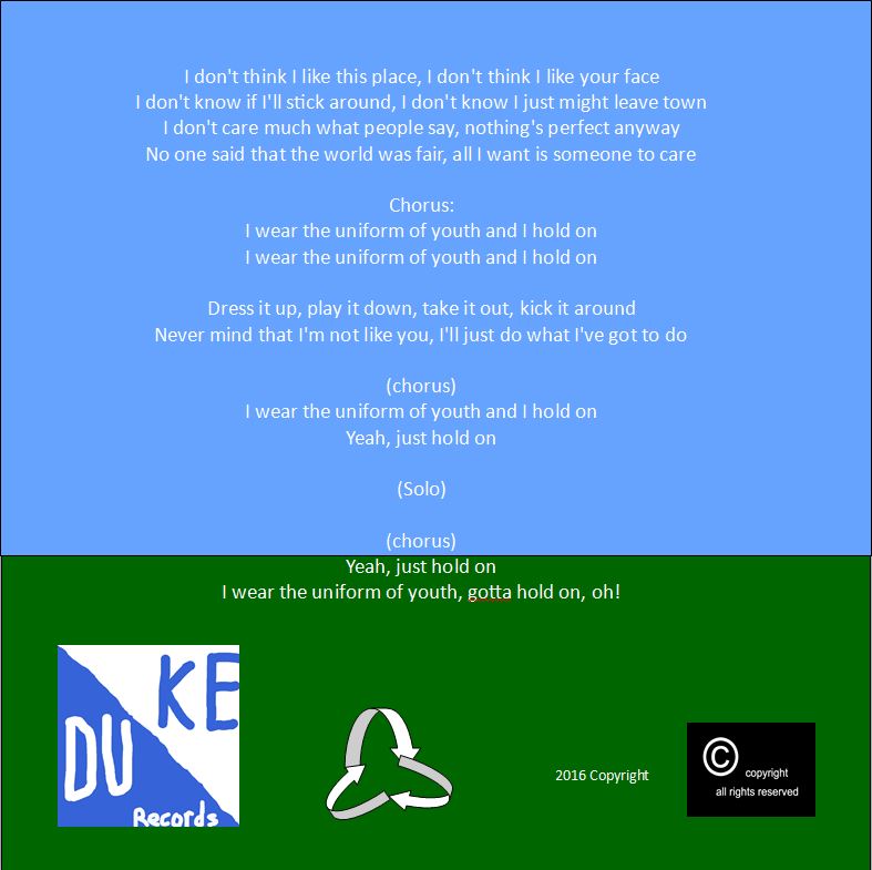
In this first stage of the background, I used a custom brush of leaves and grass in the color of forest green. I then used the text tool to create "Uniform of Youth by Mr Mister"
In this next stage, I added a sky blue custom brush so I could some what emulate the natural color of the sky. I also left a slight outline of the general shape of the car.

Finally, I edited the car while adding another custom brush tool of grass so the car blends into the grass. Fianlly, I used two custom cloud brushes so I could blend the sky furthermore to make it look a little more natural.
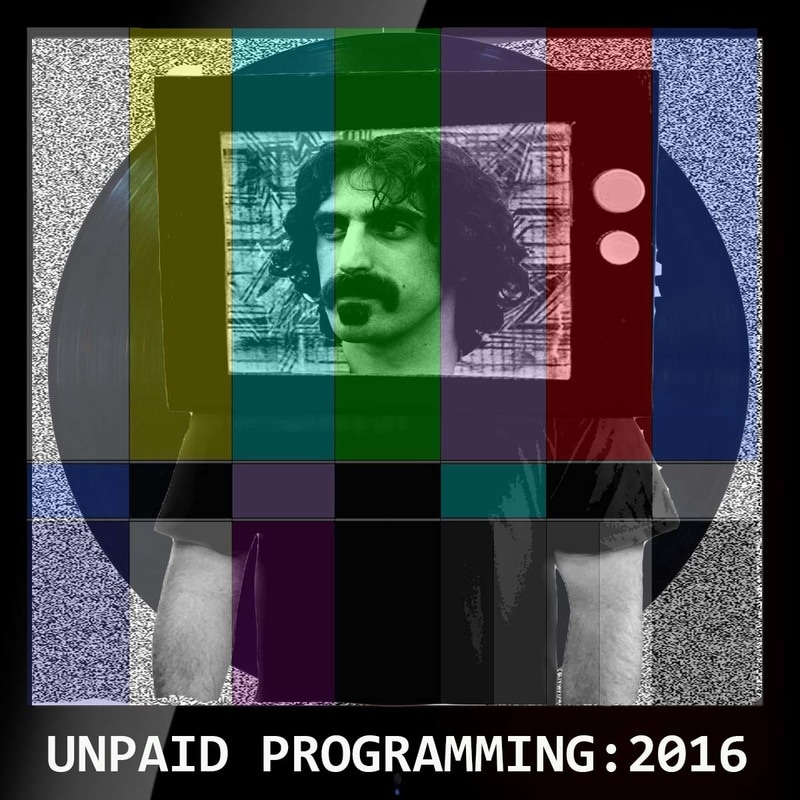
Second Album Cover
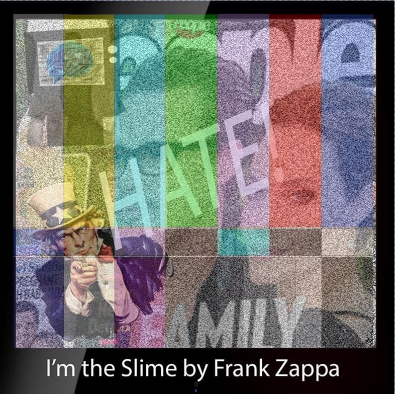
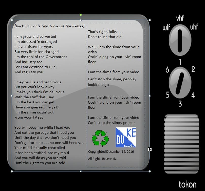
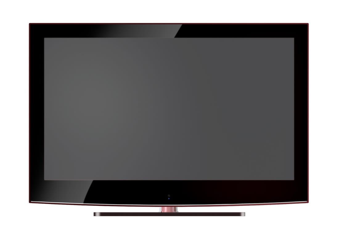
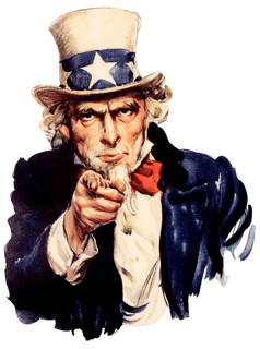
I am extremely proud of my second album cover, which was inspired by the song "I'm the Slime" by Frank Zappa. When I thought of how to create this album I listened to the song several times while examining the lyrics. The song spoke of television and media as a whole controls and addicts the population. So i began to work. I believed that the album cover should take place in a T.V set because of the theme of the song. Instead of just putting a bright normal television, I wanted to make it dark and creepy, kind of like some of the lyrics within the song. So I added the the static and the error screen to the T.V to create an atmosphere. Now I needed to get the focus of the song. So I scoured the internet for pop culture magazines, pop culture icons, etc. That's why I added the People's Magazine, T.V with a Brain, and the Uncle Sam poster. I used all types of "Lasso/Selection" tools trough out the project to get a the perfect cut. I used multiple media outlets to create this collage. I then used the text tool in Photoshop to write the word "HATE" to top off the negative message given by the album. On the Second page, I used the clip art option to create another television screen to keep the media theme rolling. Finally, I added my Record Company Logo with the recycling symbol along with he copyright and "All Right's Reserved". I really loved this project and I surpases my artistic expectations for myself. I"m verry excited to take the skills that I leanred in this project and apply them to future projects. I personally believe that his is my best peice of work yet.
Original Images
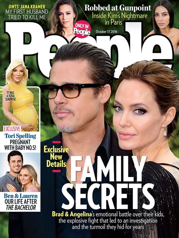
I used the "Family Secrets", "Ben and Laura", and "Tori Spelling" images as all diferent images.

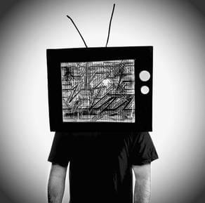
Tee Shirt Transfer
After making a creative and intuitive album cover, I was tasked with making a Tee Shirt design to promote the tour. I liked the idea of the whole theme of television . So, following the last design, I made the TV Set my border with the static screen and the error lines. But, I wanted to do something more, something creative. I didn't want to just put a picture of Frank Zappa, I wanted to incorporate him differently. So, I used the Magnetic Lasso Tool to cut out a torso of a human and mold it onto a old school T.V set. I then did the same thing but I took Frank Zappa's head and edited it into the TV Screen. But, it was missing something. I remembered what this whole project started with, Mr Adams showing us his record player. So, I thought of editing in a record. So first, I used the Magnetic Lasso tool to cut out a record and move it into the picture. I then manipulated the layers, to make the vinyl behind the Frank Zappa TV Set, but in front of the static and before the error lines. I truly enjoyed doing this project and this album cover design as a whole. It was a lot of fun delving into my creative side and designing something to do with music. I hope to take all the skills that I applied to these projects and use them in future endeavors.
